Plenty of chart styles are available in Google Sheets to showcase the work attractively. Among them, the scorecard chart stands out for different essential purposes. However, creating a scorecard chart in Google Sheets allows you to display key performance indicators easily.
There could be various situations, and you may be in want of a scorecard chart in Google Sheets. For example, the number of contracts that have been signed-in this month in comparison previous month, calculate website traffic for the first few months of the year, and the one I choose for this article- compares sales revenue for different years’ first four-month.
However, creating a scorecard chart in Google Sheets is super easy. Therefore, displaying key performance indicators (KPIs) will not be a mammoth task using a scorecard chart.
In this entire post, I’ll be with you to let you know how you can create a scorecard chart in Google Sheets.
What Actually a Scorecard Chart in Google Sheets Is?
For displaying a summary of a metric (KPIs), a scorecard chart is the best option to go with. The scorecard result comes based on performance analysis.
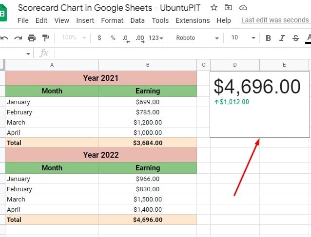
However, the performance analysis is the baseline value and key value’s difference outcome. Here’s a scorecard chart example below to show you how it works.
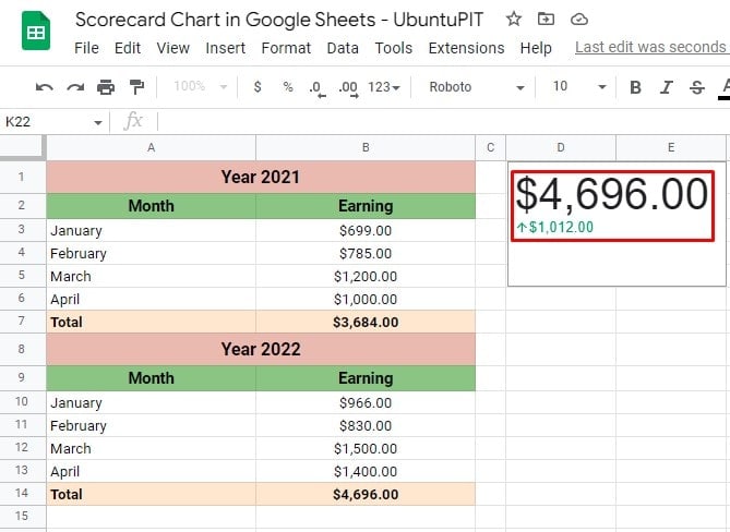 The above example displays a sales revenue comparison by creating a scorecard chart. The sales revenues of 2022 (first four months) are compared to the 2021’s first four months of sales revenue.
And the scorecard chart will show you the changes between these two years (initial four months) datasets.
As you’re seeing on the right side of the above example sheet, the scorecard result highlights the key difference metric in a visible and easy-to-read way.
How to Create a Scorecard Chart in Google Sheets
You not only can create a scorecard chart in Google Sheets from one cell data but also from multiple cell data. Let’s see the step-by-step process below.
Create a Scorecard Chart- One Cell Data
Since I explained to you what a scorecard chart is in Google Sheets, let’s see how you can create one.
However, let me show you how to first make a scorecard chart in Google Sheets from one cell data.
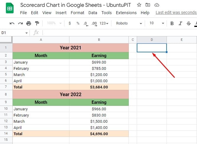
Step 1: Select an Empty Cell
Go to your Google Sheets that contain your data, and pick an empty cell. Make sure the cell you choose is outside of your data sheet cell. My example below picked cell D2 to get the scorecard chart.
Step 2: Insert Chart from Top Menu
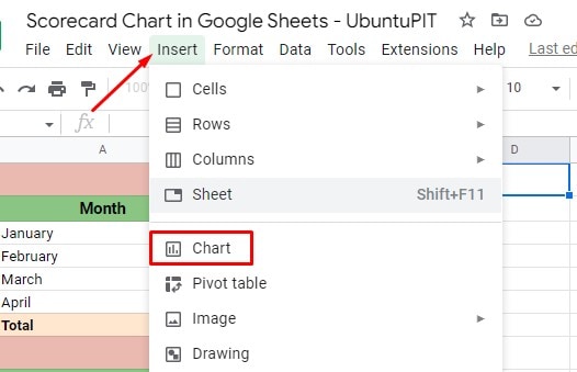
Once you click on the cell you choose to have the scorecard chart, hover your cursor over the top menu. Now click on Insert and pick chart from the resulting popup menu.
Step 3: Set the Chart Type from Chart Editor
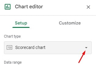
Once you follow the last step, you’ll get the Chart editor section at the right of your screen. Select the Setup section, and click on the Chart type dropdown to create a scorecard chart in Google Sheets.
As a result, you’ll get a bunch of chart styles there. Find and set ‘Scorecard chart‘ from the chart type list.
Step 4: Set the Key and Baseline Value
It’s time to add the Key Value box and Baseline Value box. Key value refers to the value you want to point up in your chart. And the baseline value refers to the comparison number.
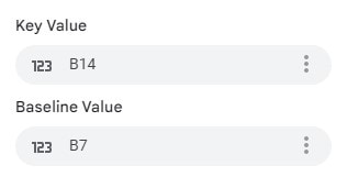
Now, click on the respective value box and type or select the cell name of each value. In my example datasheet, cell B14 contains the Key Value and the Baseline value in cell B7.
Step 5: The Scorecard Result with KPIs
There you have it! When you’ve successfully selected the value (Key Value and Baseline Value), a scorecard chart will appear on your picked cell like the one below.
As you can see, the two values have clear differences. The value with a left high arrow under the Key value in cell D2 is the KPIs.
This is how you can create a scorecard chart in Google Sheets from a particular cell. Now. Let’s move on to the method of how you can create a scorecard chart from multiple cells in your datasheet.
Create a Scorecard Chart- Multiple Cell Data
In the last section, you learned how to create a scorecard chart from one cell data. You’ll be glad that you can make a scorecard chart from a range of data and display the KPIs accordingly.
In the last example, I had the total sales revenue (summed up sales data) columns from where I created the scorecard chart.
Now let’s assume you have a range of data without having any summed-up total like the example below, and you need to create a scorecard chart here.
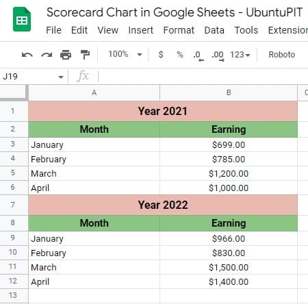
As you can see, the above example sheet doesn’t have any cells, including the summed-up total like before. However, still, you’ll be able to create a scorecard chart in Google Sheets.
The scorecard chart-creating process for multiple cells will be the same as a single cell except for some slight differences.
However, the differences will be in the Key Value and Baseline Value part, where you need to modify things a bit compared to the single-cell procedure.
Therefore, put the appropriate cell ranges in the respective Key Value and Baseline Value boxes. And click on the Aggregate box below the value part.
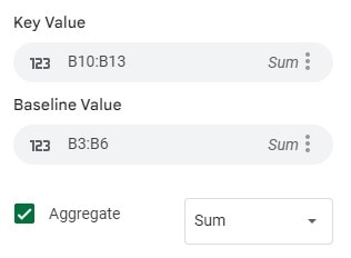
Once you click on the Aggregate checkbox, you’ll get multiple options, such as Count, Min, Max, Average, and Median. For my example, I need to go with the SUM.
Now see below! Isn’t the scorecard chart the same as before? Yes, it is without just one simple difference. That is, instead of one cell data as my value, I have a range of data this time.
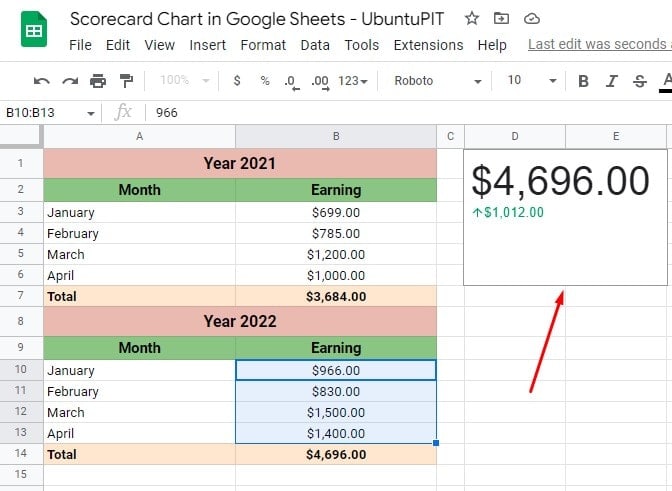
How to Customize a Scorecard Chart
Once you’ve completed your scorecard chart in your Google Sheets, you can customize it as you want.
There are some chart criteria available on where you could do customization. However, to do the customization, you need to go to Chart editor and click on Customize tab.
The following are the areas where you can make customization-
- Chart style: This includes colors, font styles customizing options for your chart.
- Key value: In this section, you can change the key value that you put initially, along with changing the option of color and font of the key value. Last, the number formatting of the key value is also customizable.
- Baseline value: You’ll find the option to change the comparison values to- adding description, changing font and color, adding a percentage, etc.
- Chart and axis tiles: If you want to add a title for your chart, you can add it from here. Besides, you can adjust the font of the title.
Closing Statement
Well, it’s a wrap. Follow the above steps to create a scorecard chart in Google Sheets and display the KPIs (key performance indicators) of a datasheet.
Besides, customize the chart as you want. If you wish to create a scorecard chart for a single cell or a range of cells, both are possible by following these easy steps.
It’s time to say goodbye. I’ll be back soon with another one. Before leaving, I would like to say please share your feedback on this post in the below comment section.
However, if you find this post compelling and helpful, do share it with others. Last but not least, stay with UbuntuPIT and enrich your tech knowledge.
