Among various kinds of charts that Google sheets have (Organizational, Pie, Column, Line, Combo charts), the Waterfall chart is one of the important ones. It’s also called McKinsey Charts, Cascade charts, or Bridge charts. What makes the waterfall chart an important one for users? Well, the answer is quite simple. If you want to present your data in a more understanding way and make it visually treatable to the eyes, then waterfall charts stand out. However, making waterfall charts in Google sheets is not difficult at all in comparison with its benefits.
Simply put, a waterfall chart is a visualization tool indeed. There are many a thing you can monitor through waterfall charts – traffic sources, number of leads, blog visits to your website. For example, let’s assume you have a blog site and want to count the visitors’ numbers over a particular course of time. Well, here the waterfall charts in Google sheets come into play. As a result, you can easily track or monitor visitors to your blog site.
Thus, if you’re looking for an easy way to set up your Google Sheets data in a visually appealing way, you’re in the right place. Nevertheless, I’ll take you through a complete guide on how to create and customize waterfall charts easily in google sheets.
Make Waterfall Charts in Google Sheets
Well, let’s start the process. To easily make waterfall charts in Google sheets, you just need to follow some basic easy steps. And, you’ll be done and dusted with the whole process.
Let’s Prepare A Data Sheet
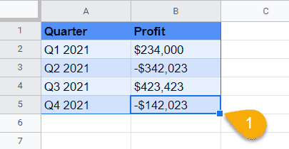
Before heading towards the process, you need to set up a data sheet on which you would like to apply a waterfall chart. Here’s the datasheet I’ll be using for the entire post.
Get Your Waterfall Charts Prepared
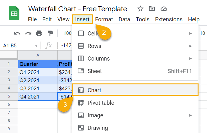
In this step, first, select the entire datasheet and click on the Insert option from the above menu. By doing so, you’ll get an option called Chart in the submenu. Now, click on it.
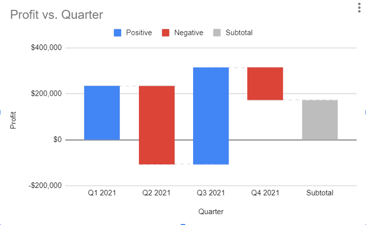
Once you’ve completed the above instruction correctly, a waterfall chart will appear on your Google sheets like the below one. However, any other chart will appear instead of a waterfall chart; in any case, then you need to do some more clicks to have waterfall charts in your Google sheets manually. Let’s see the next step.
Set up Waterfall Chart In Google Sheets from Chart Editor
As you didn’t get your chart in your Google sheets, you’ve to do some manual work for getting the waterfall chart finally.
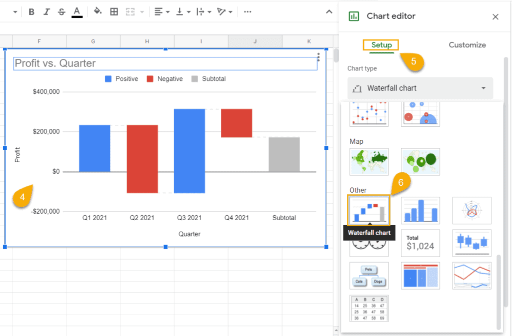
First, click on the chart right now you’ve in your Google sheets, then tap on 3 dots at the top right corner of your chart.
By doing so, the Chart editor section will open from where you’ve to select Setup. Now, click the “Chart type” dropdown, and you’ll get plenty of chart options. Scroll down a bit, and you’ll see the Waterfall chart below the Other section. Finally, select and make waterfall charts in Google sheets.
Customize Waterfall Charts In Google Sheets
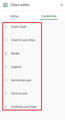
There are so many things to customize once you create your waterfall chart. Here’s the customization options list you could have in your chart. However, these customizations will make your chart more audience-engaging.
Therefore, I’ll let you know each and every customization process to this entire section. Let’s start.
1. Changing Chart and Axis Titles of Your Waterfall Charts
There’s no doubt that title is very much important for anything because it describes all. So, the waterfall chart title is as much important as other things. Therefore, you need to know how to customize the chart title once you create one.
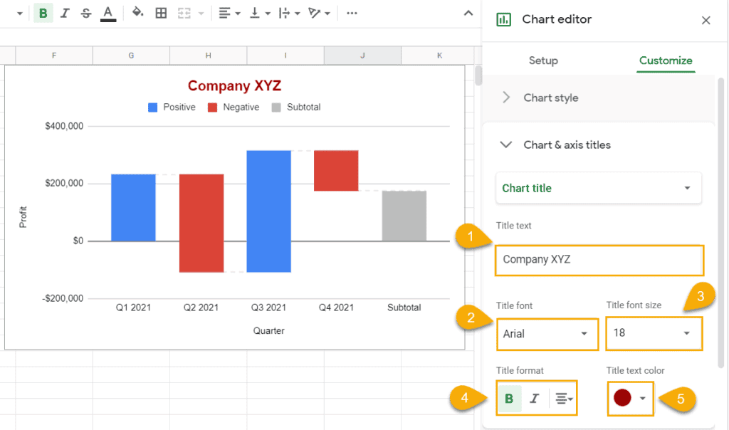
For doing so, double-click on the chart and open the Chart Editor, choose Customize tab from there, and finally open Chart and axis titles from there. Now you’ll get a bunch of customization options for your chart title.
You can customize the title’s text, font, font size, format, and text color as you want.
2. Changing Style of Your Waterfall Charts
Well, you already have your chart but do you want to make it more attractive to your audience by customizing your chart style? Sometimes you might get bored with regular white background color, or you might wish to add the connector lines in your chart. Well, how to do that? Let’s see.
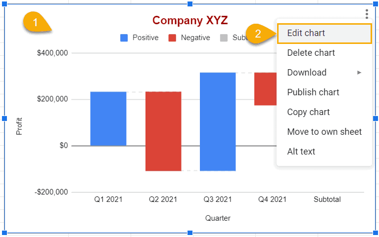
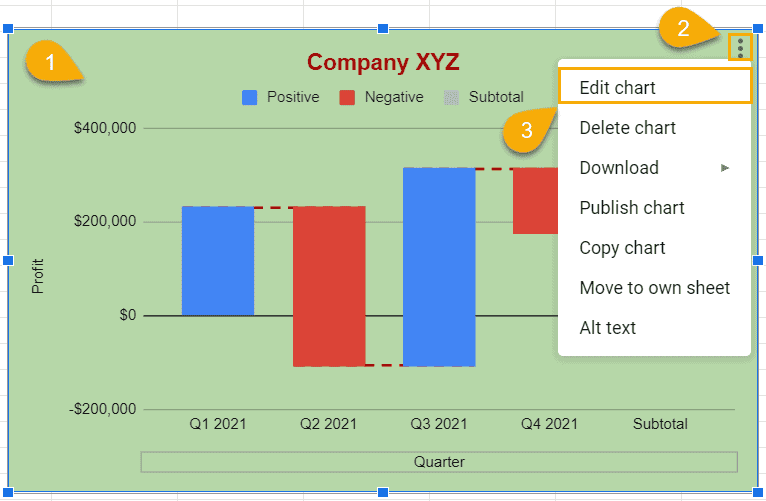
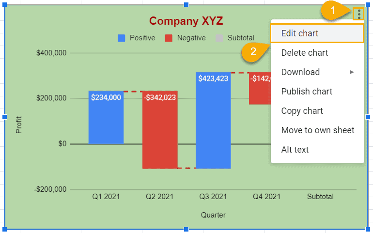
At first, double-click on your chart and select Edit chart by clicking on the 3 dots menu at the top right corner.
Now, hover over the Customize section in your Chart editor and finally expand the dropdown of Chart style. Well, here you’re with all the styling options- background color, font, show connector lines activation box along with its color and thickness, and connector line dash type choosing option at last.
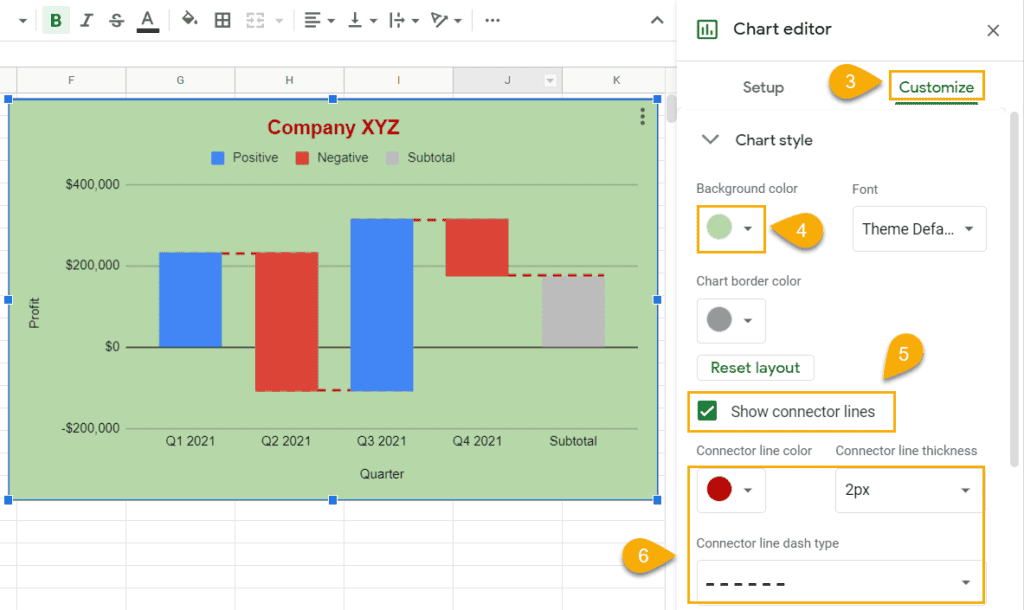
Whenever you change something to your chart style, that will reflect in your chart instantly. Have a look at the above chart changed after applying the options.
3. Adding Data Labels to Waterfall Charts
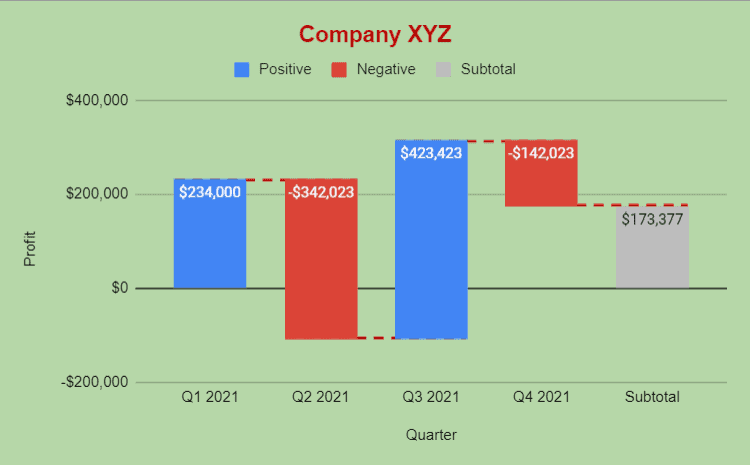
You can apply data labels to your chart to make it more informative. Therefore you need to follow some basic steps. Let’s see how to do that.
At first, go to the Edit chart like before; the process is the same.
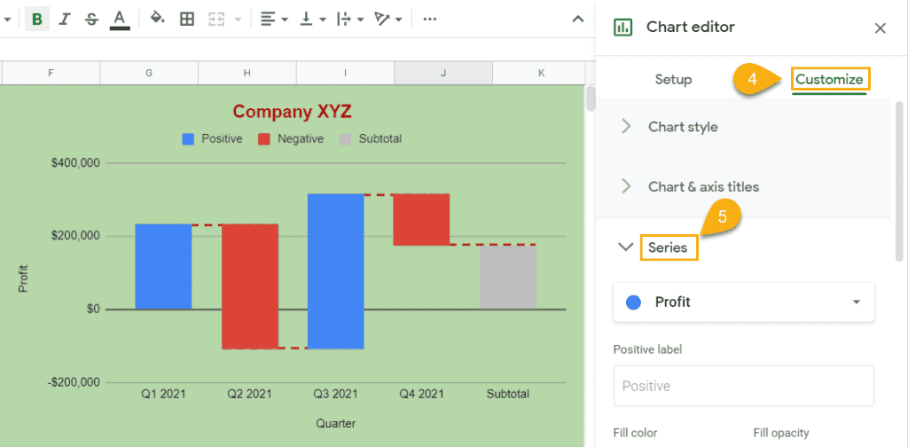
Also, select Customize section as you did earlier to customize the chart title and style. Well, now expand the Series menu and scroll down a bit.
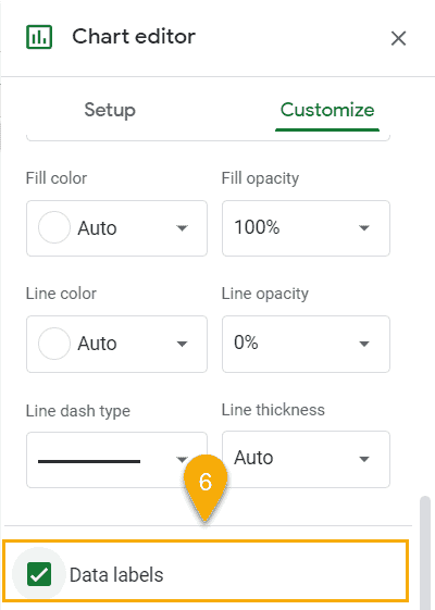
Once you find this portion, stop scrolling. At this point, tik the Data labels for getting the data in your chart.
Well, here’s the result below. From now, you can clearly see your informative data in your chart because of adding data labels to your chart.
4. Adding and Removing Gridlines and Tick Marks in Your Waterfall Chart
Here is another feature- adding and removing gridlines and tick marks in your chart that Googles adds to your service. Follow the steps below and easily get this in no time.
To begin with, follow the same process to get reached the Edit chart as you’re doing to customize every section.
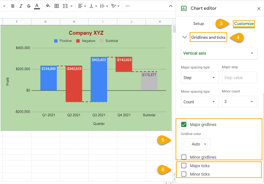
Now, choose Gridlines and ticks from the Customize menu. And follow the below-marked image and customize as you want. So, you can see the outcome at the left of your Google sheets which part contains your waterfall chat.
Closing Statement
To sum up, all the things have explained above how to set up your Google Sheets data in an appealing way using a waterfall chart. You need to follow the steps to create waterfall charts in your Google sheets and customize them as you want.
